Product Design at Fiserv
HOMEPAGE REDESIGN
Timeline
8 weeks
Tools
Photoshop
Illustrator
Zoom
Role
UX Designer
Team
Dom Propati
Jimmy Chen
Jongho Lee
Internship Overview
Building a developer portal for Fiserv fintech products
Fiserv is a leading technology provider in the FinTech industry. As a UX designer intern, I worked with cross-functional teams on the Fiserv Developer Studio website. One of the biggest challenges for me and my teammates was redesigning the homepage of the website. Redesigning from the ground up, our goal was to create an impactful way to tell stories, improve the user experience, and inform users about Developer Studio’s products and services.
Challenge
How to make it easy for potential users to understand and navigate to services and products on Developer Studio?
Fiserv Developer Studio is a platform for developers to leverage Fiserv’s APIs for various financial services. Version 1.0 of the site was built purely for functionality and focused primarily on the MVP. Since Fiserv has a large number of products, it was difficult to present and categorize the information and guide users to their goals quickly. With the increasing number of users, the site needed a completely new design, and it all started with the homepage.
01
Research
Competitive Analysis
Interview Insights
2 new users
2 screened out
01
Expectations
Users are willing to find instructions, navigation, and source code on developer portals.
02
Likes
Users prefer structured information layout, clear and simple navigation and bolded keywords.
03
Dislikes
Users don’t like giant contents blocks, buttons with different features staying together, and lack of icons and graphs.
04
Company info
Users agree that company information add some trust to the website, and help them to know the size of the community.
05
Decision-making
Users choose service provider with easy-to-use experience, reliable and secure server, and key API components.
06
Time spent on page
Users spend most of time on headlines and color-coded elements. Less time is spent on descriptions and examples.
Survey
Demographics
9 participants
Mostly experienced user with developer portal (8 people ranked above 3/5)
Insights
Most important information – API > Documentation > Products > Security > Company Info
Eye-catching elements – Features > Visuals = Descriptions > Icons = Examples
Case study – Half of the participants would check before using the products
Company info – News > Blog > Forum = Clientele > Social Media
Decision making – Resources > Service list = Security > Clientele
Onboarding – Video Tutorial = Step-by-step instruction > Documentation = Direct Support
02
Analysis
Jobs-to-be-done
MVPs
Create engaging storytelling and clear instructions for a first-time user
Why Sections containing information about strengths (Security, APIs, etc.)
Easy Navigation in a structured format with visualization, color coding, & headlines
Lead users to easily navigate to the service they want (Feature list)
Accessible resources with handy support (Community, Direct support, Tutorials)
Should-haves
Easy onboarding procedure (Tutorial, Step-by-step instructions)
Icons and In-text URLs for easy navigation
Company Information (News, Blogs, Forums)
Case studies that generate trust and product capabilities
Archetypes
After identifying the user demographic and their needs, we created three different archetypes: Product Manager, Experienced Engineer, and Junior Engineer. For each of the archetypes, we created an empathy and journey map and analyzed each user experience with developer sites to refine content for Developer Studio’s homepage.
Empathy Maps
Journey Maps
03
DEsign
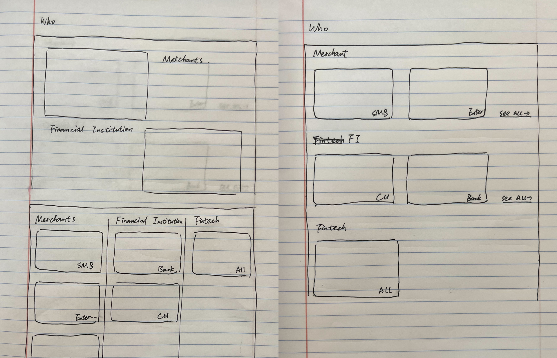
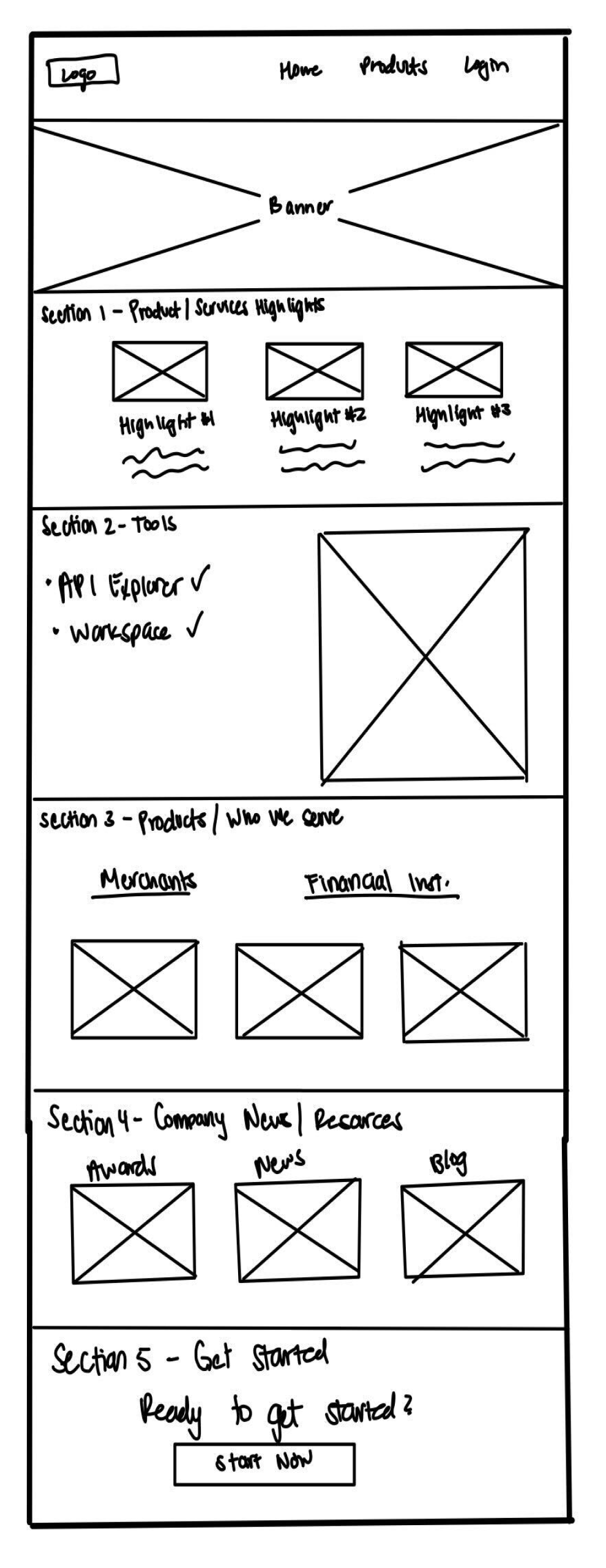
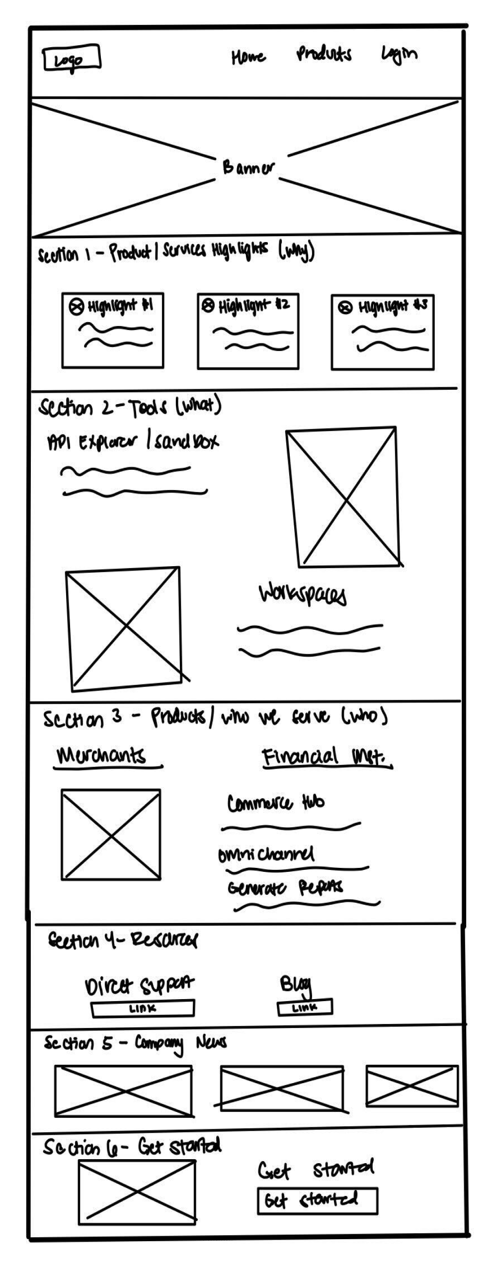
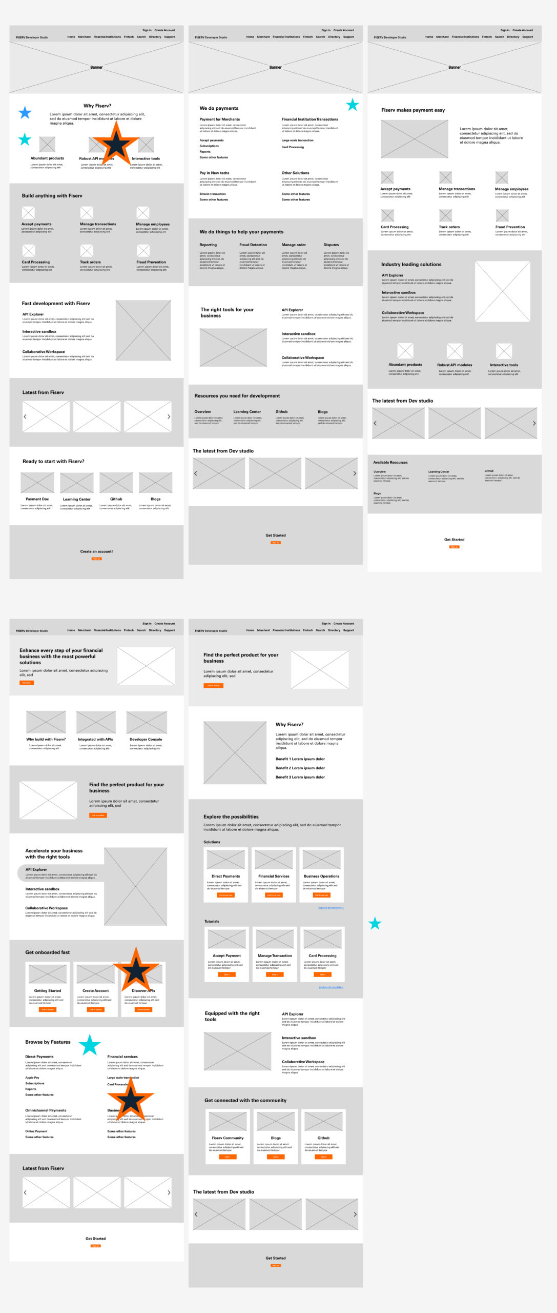
Mid-fi Mockup
Fidelity for lo-fi wireframe was boosted into mid-fi. Fidelity was boosted in terms of layout and each section’s content.
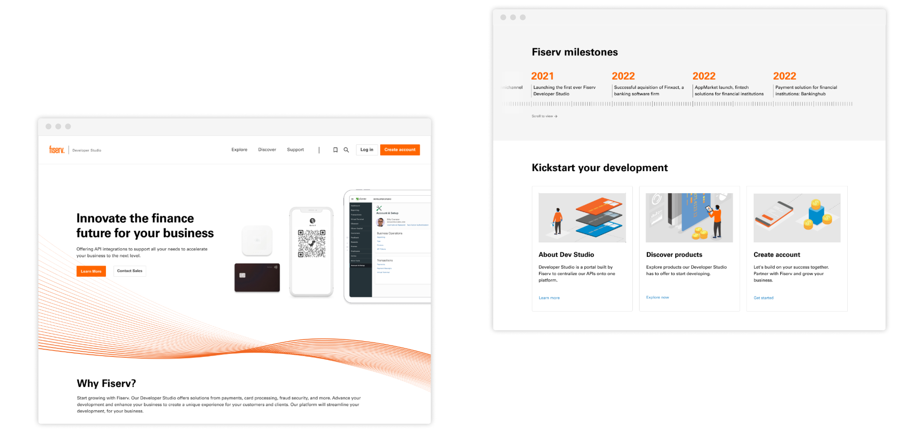
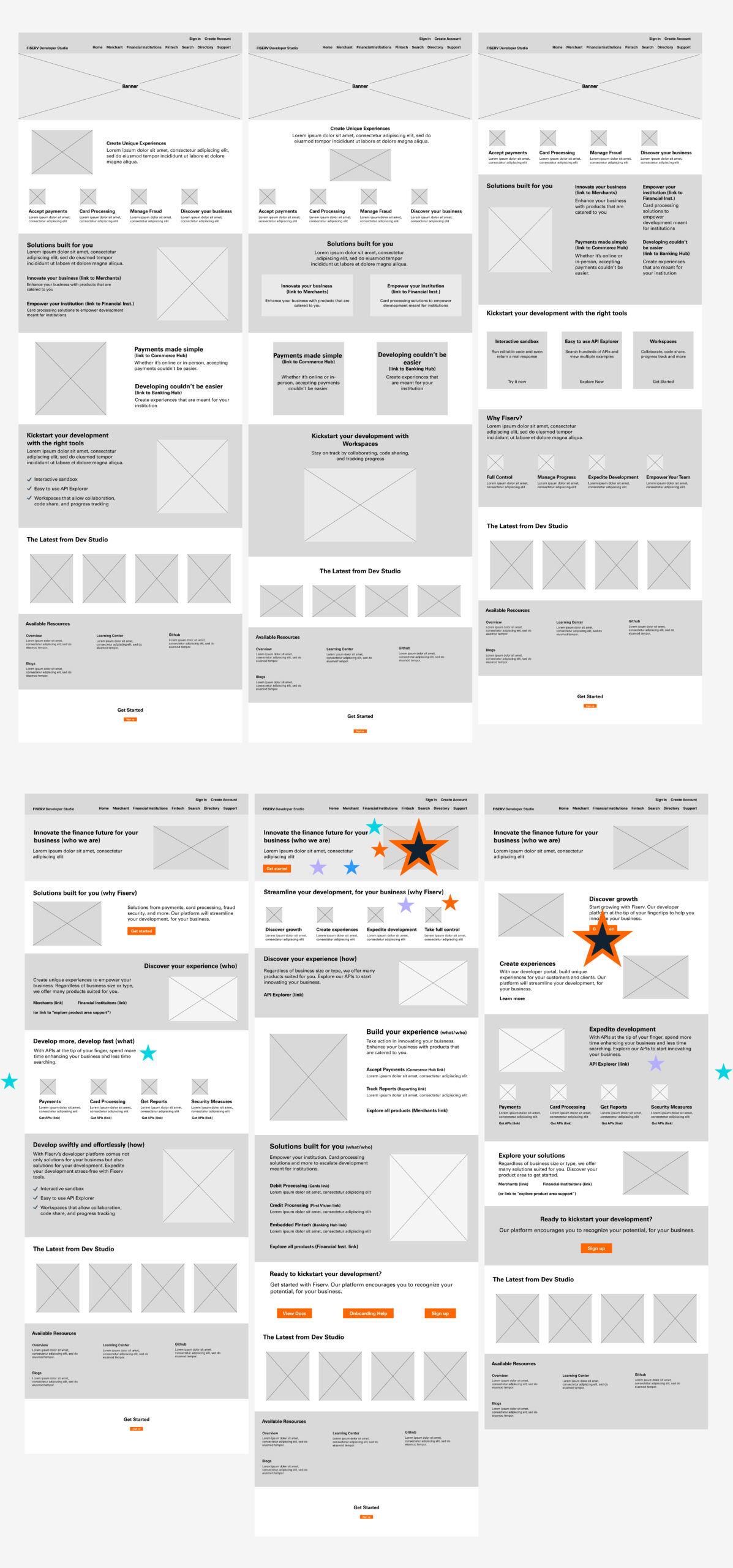
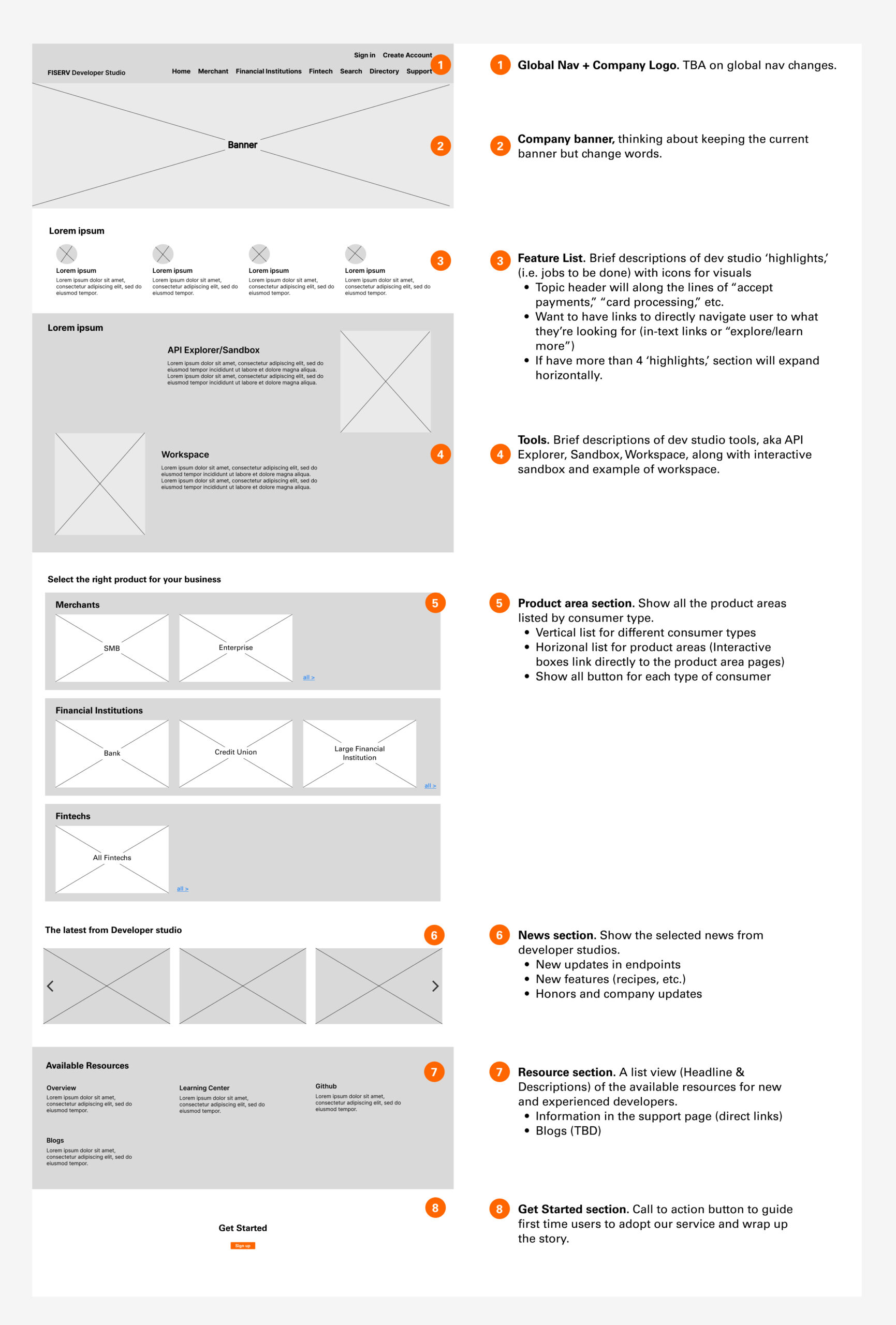
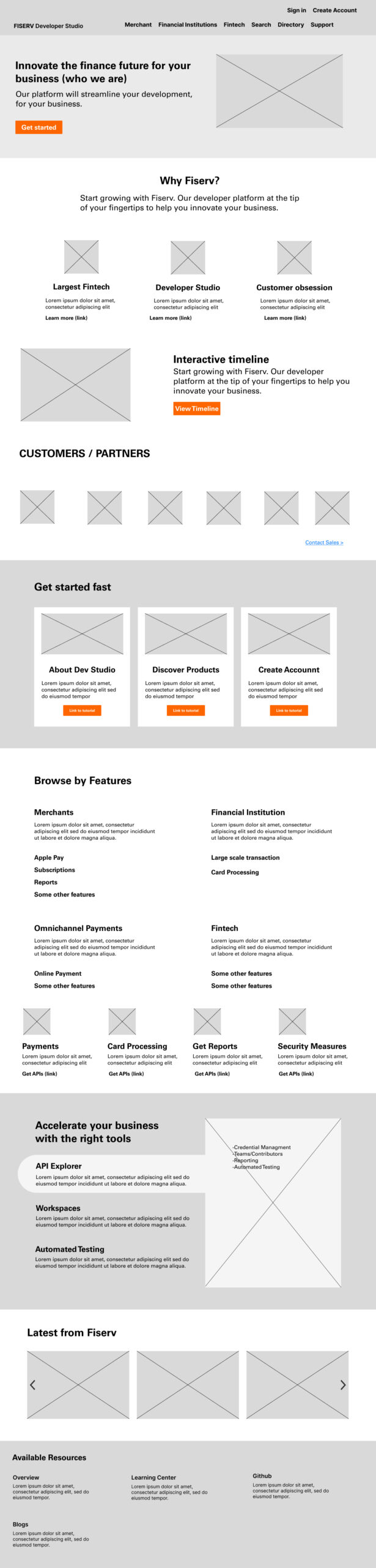
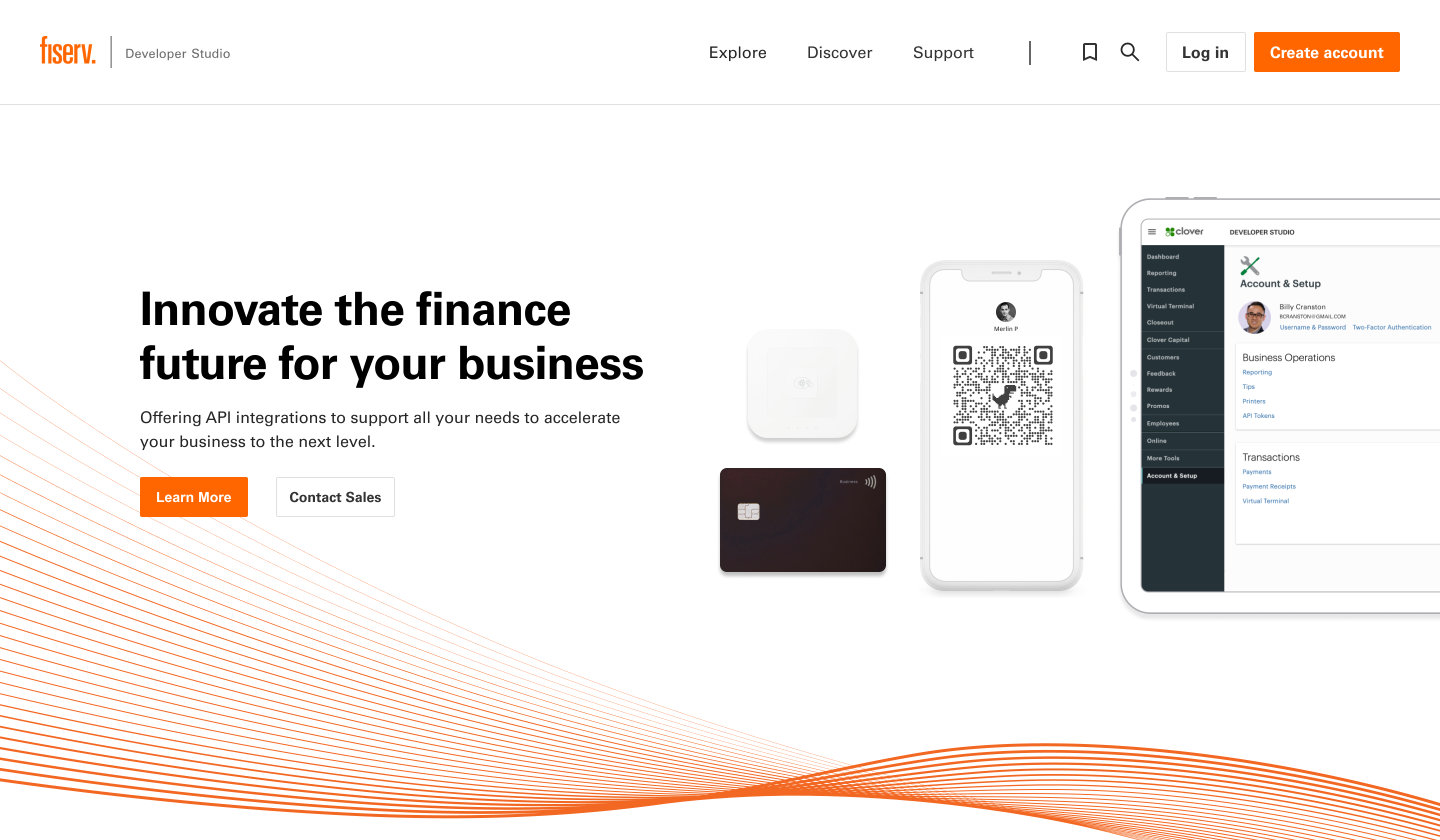
Banner
The redesigned banner highlights the capabilities of service with strong visual aids. Redesigned CTA buttons inform the user of two different business models that Fiserv offers.
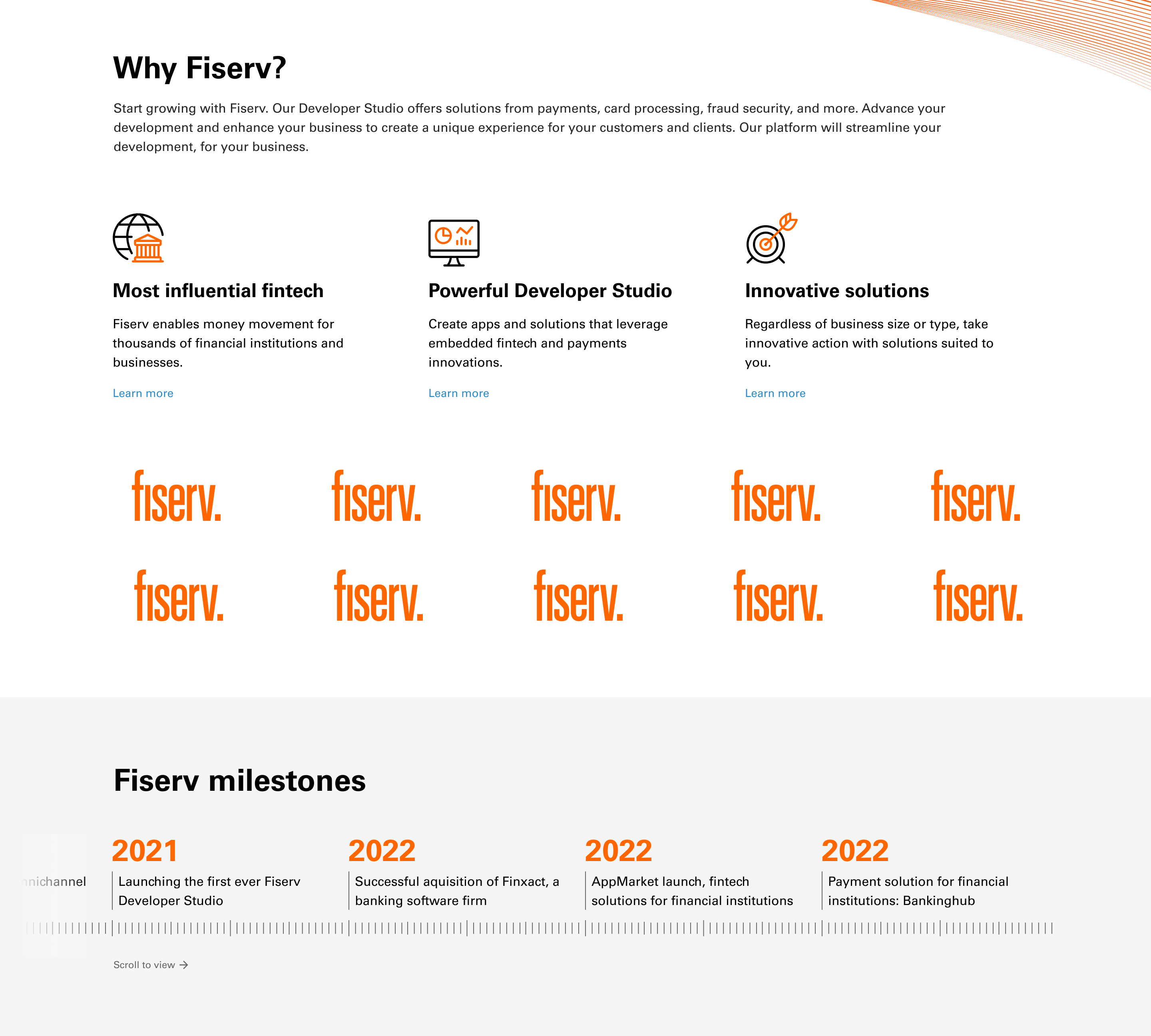
Why Section
The why section starts above the cut line, and users can easily get into the storytelling from the first page. By informing the strength of Fiserv’s developer studio, adding the customer/partner logo, and displaying an interactive timeline, it clearly differentiates Fiserv from its competitors and gives first-time users a reason to choose.
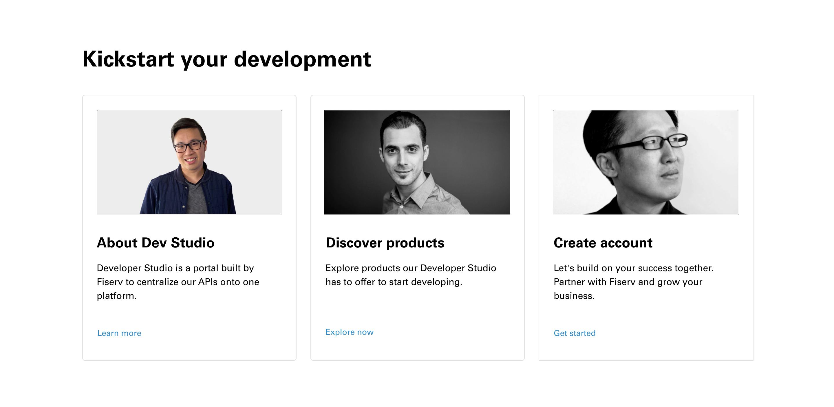
Onbroading
There is then a quick onboarding section that begins to guide first-time users through the basics of Developer Studio, including discovering the product and creating a new account.
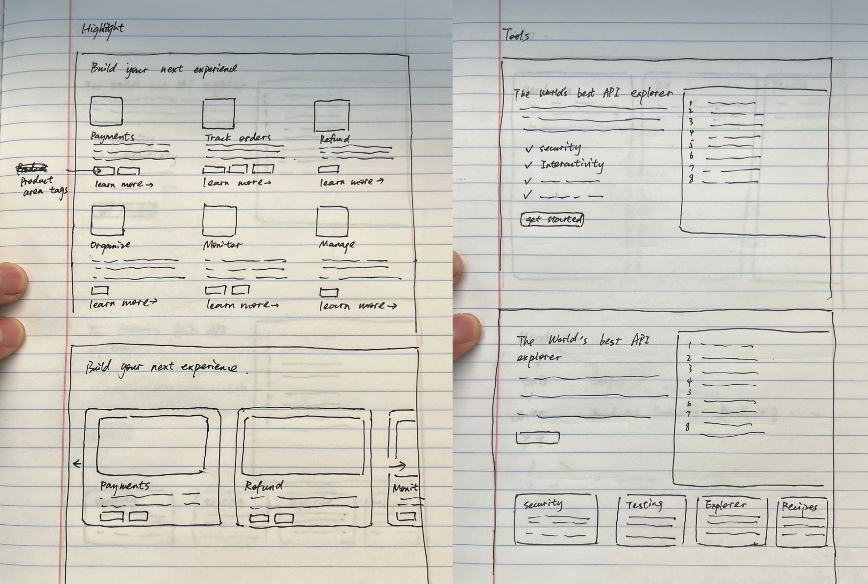
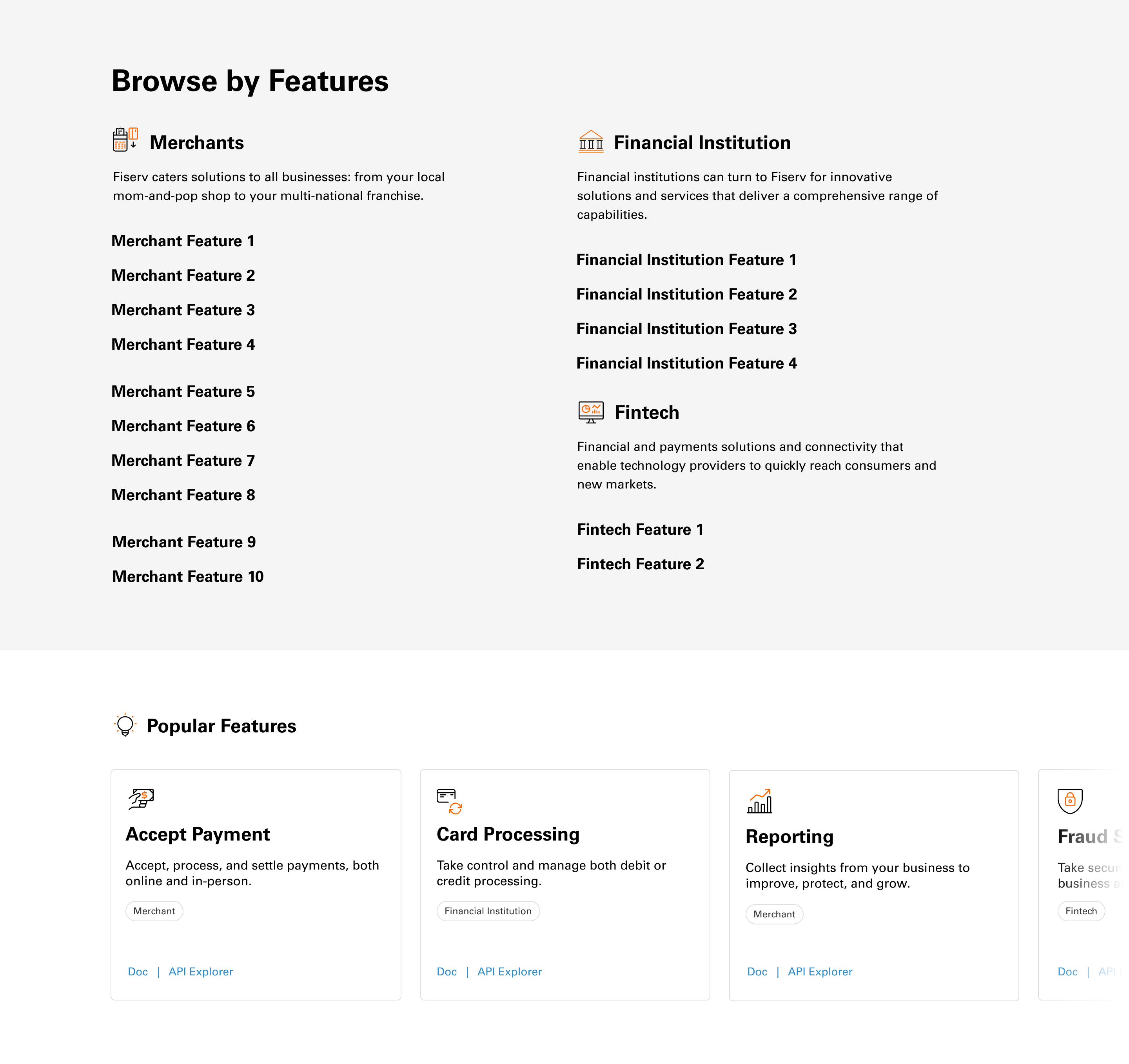
Feature List
The feature list is designed for experienced users/developers on the principle of findability. All the features are services (jobs-to-be-done) for a specific type of user and are organized by different product areas. A popular feature carousel comes afterward for quick navigation.
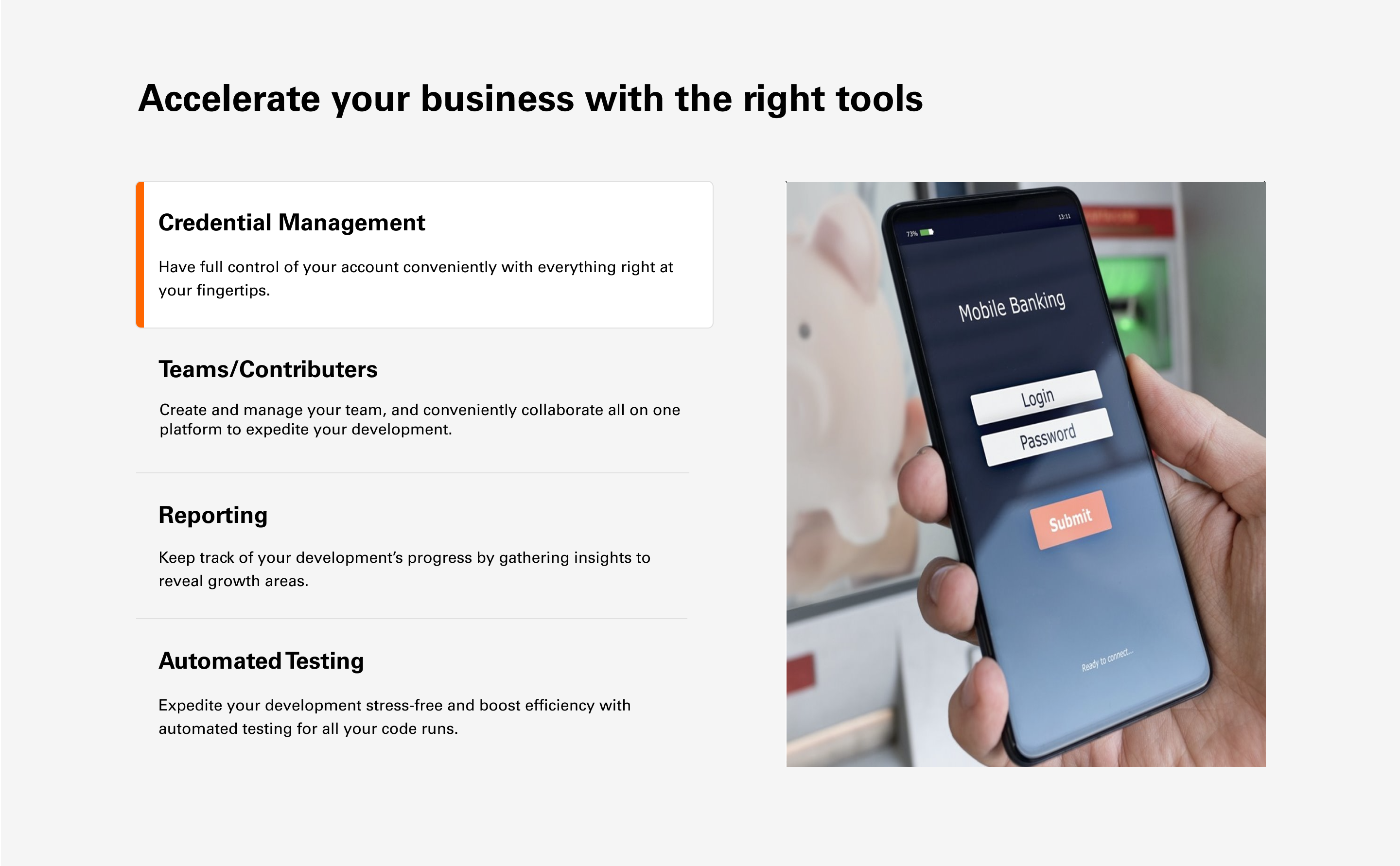
Tools
The tool section, designed for first-time developers, integrates multiple functions into interactive boxes and highlights the efficiency Developer Studio provides in writing and testing codes.
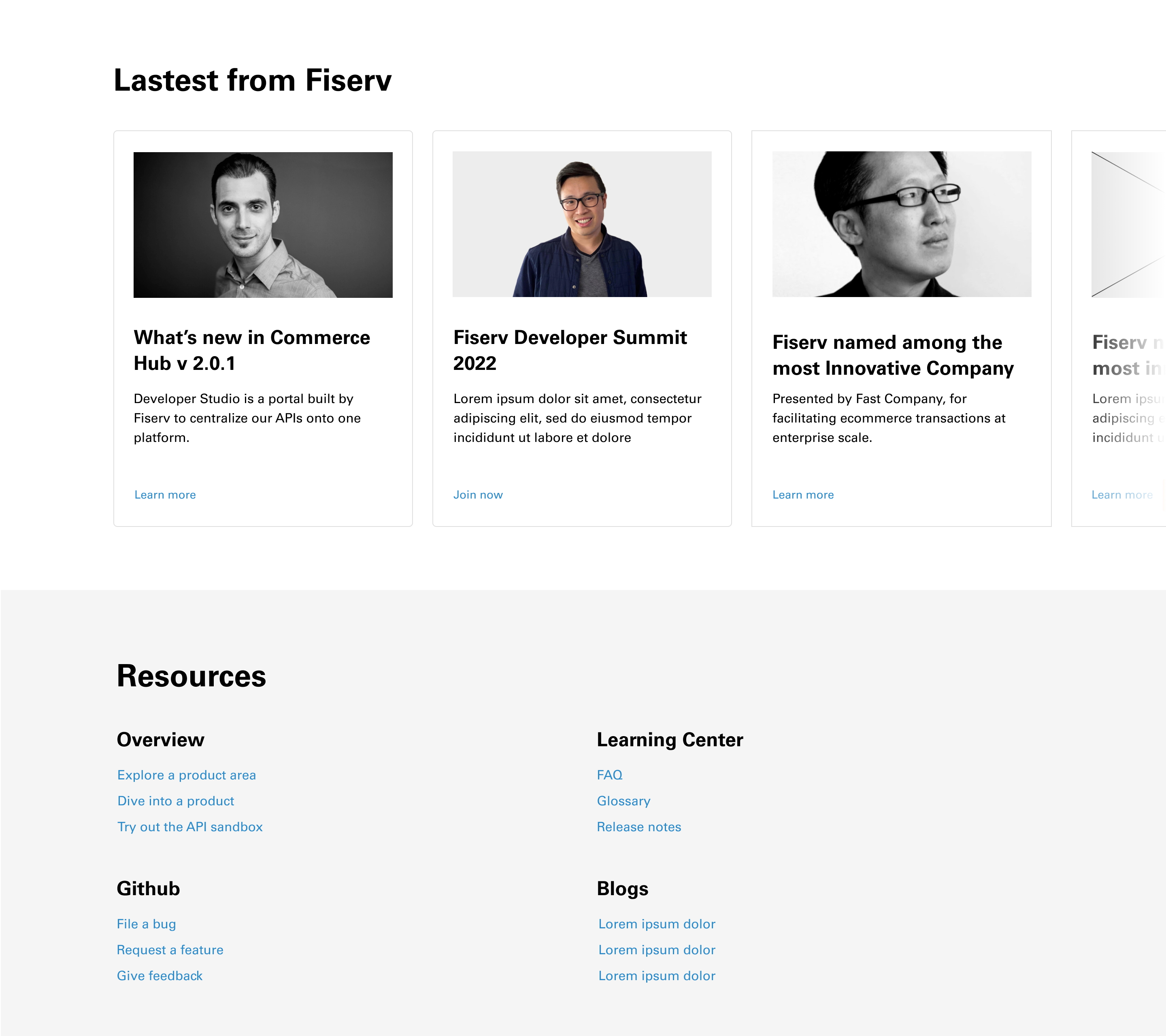
Footer
The footer of the homepage mainly focuses on the community-building aspect by introducing frequently updated news and resources. It could help users quickly fix their bugs and get assisted.